Learning Objectives
Theory / Be able to explain ...
- The basic kinds of plots
- Matplotlib's 3 step plotting process
- How plots are decorated with various options
- The limitations of Matplotlib's 2D plotting model
Skills / Know how to ...
- Create and display common types of plots
- Pass data and set options for each plot type
- Find your way around the documentation
- Use add-on libraries to enhance your plots
What's Matplotlib?
From the docs ...
“Matplotlib is a library for making 2D plots of arrays in Python … designed with the philosophy that you should be able to create simple plots with just a few commands, or just one! If you want to see a histogram of your data, you shouldn’t need to instantiate objects, call methods, set properties, and so on; it should just work.”
Goal: Easy, Professional Plots
More from the docs …
“Plots should look great - publication quality. One important requirement … is that the text looks good (antialiased, etc.)
“Code should be easy enough that [anyone] can understand it and extend it.
“Making plots should be easy.”
Powerful and Flexible API
Input is 2D data in many possible formats:
- Lists, tuples, … arrays from NumPy or Pandas
Can produce a wide variety of plots:
- Line, Bar, Pie, and Scatter plots
- Histograms and Spectrograms
- Error plots, Box and Whisker plots, and Violin plots
- Polar plots and Hexagonal Binning ("heatmap") plots
- ...
Standard Imports
The remaining slides assume that we have already imported NumPy, Pandas, and Matplotlib in the standard way. Note that we are just importing matplotlib.pyplot below. You can explore the rest of Matplotlib on your own time!
import numpy as np
import pandas as pd
import matplotlib.pyplot as plt
Intuitive 3 Step Process
Make a new plot
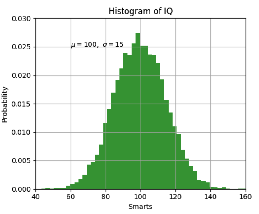
plt.hist(...)
Set a few options
plt.xlabel('Smarts')
...
Display the plot
plt.show()

Note: Data is in Columns
pyplot generally assumes that data is passed as 1D sequences (lists, Pandas Series, NumPy arrays, etc.)
If using DataFrames or other 2D arrays, then slice column-wise to define x-coordinates and y-coordinates.
Line Chart
# A basic 2D plot
plt.plot(
  [1,2,4,8], # x coords
  [1,2,3,4], # y coords
  "b-"       # blue (b) line (-)
)
plt.show()
Simple Point Plot
# A basic 2D plot
plt.plot(
  [1,2,4,8], # x coords
  [1,2,3,4], # y coords
  "bo"       # blue (b) dots (o)
)
plt.show()
Line Chart with Markers
# A basic 2D plot
plt.plot(
  [1,2,4,8], # x coords
  [1,2,3,4], # y coords
  "r-o"      # red (r) line (-) dots (o)
)
plt.show()
Multiple Lines
plt.plot(
  [1,2,3,4],[1,2,4,8],"r-o", #series 1 with red lines and dots
  [1,2,3,4],[1,4,9,16],"g-^" # series 2 green lines and triangles
)
plt.show()
Scatter Plot
plt.scatter(
  [1,4,2,8],       # x coords
  [1,2,3,4],       # y coords
  c='b',           # color
  s=[10,50,200,20] # sizes
)
plt.show()
Bar Chart
plt.bar(
  [1,2,3,4], # x
  [1,2,4,8], # y
  color = "r"
)
plt.show()

# more options in the docs
Pie Chart
plt.pie(
  [1,2,3,4], # x
  labels=['a','b','c','d'])
plt.show()
Histogram
x=[x**2 for x in range(10000000)]
plt.hist(x, bins=10)
plt.show()
Scaling Axes
x=np.arange(10000) # a list of 0 ... 9999
plt.plot(
    x,x,
    x**2,x
)
plt.xscale('log')    # use log scale for x axis
plt.show()
Labels, Gridlines, etc.
We can use plotting commands (functions) to decorate our plots with x-labels, y-labels, gridlines, annotations, etc.
Each decoration can have styling properties for the text, lines, color fills, etc.
When all else fails, RTFM: https://matplotlib.org/api/pyplot_summary.html
Seaborn
Provides deeper integration with Pandas, NumPy, and Scipy to simplify plots from linear regression, clustering, time series, and other common analyses. It also adds much better default styling.
# from the Seaborn intro ...
import seaborn as sns
sns.set()
tips = sns.load_dataset("tips") # a data set in the Seaborn repo
sns.relplot(x="total_bill", y="tip", col="time",
            hue="smoker", style="smoker", size="size",
            data=tips);
Matplot3d
Provides 3D extensions of the basic plots. It is part of the Matplotlib package.
#from the docs ...

import matplotlib as mpl
from mpl_toolkits.mplot3d import Axes3D # <--- this is it here
import numpy as np
import matplotlib.pyplot as plt
mpl.rcParams['legend.fontsize'] = 10

fig = plt.figure()
ax = fig.gca(projection='3d')
theta = np.linspace(-4 * np.pi, 4 * np.pi, 100)
z = np.linspace(-2, 2, 100)
r = z**2 + 1
x = r * np.sin(theta)
y = r * np.cos(theta)
ax.plot(x, y, z, label='parametric curve')
ax.legend()
plt.show()
Holoviews
Make plots into objects that can be recalled and shown in a variety of layouts. You can even overlay them if needed. Very handy for Jupyter notebooks.
Bokeh
Bokeh is an interactive visualization library for things like dashboards. When combined with Matplotlib and pandas, it makes for a very powerful toolset.
At its most basic usage, Bokeh can be used to export plots to HTML ...
# from the docs ...

from bokeh.plotting import figure, output_file, show

# prepare some data
x = [1, 2, 3, 4, 5]
y = [6, 7, 2, 4, 5]

# output to static HTML file
output_file("lines.html")

# create a new plot with a title and axis labels
p = figure(title="simple line example", x_axis_label='x', y_axis_label='y')

# add a line renderer with legend and line thickness
p.line(x, y, legend="Temp.", line_width=2)

# show the results
show(p)
The exported plot.
Classwork (Start here in class)
- Course Schedule Part 4
- Health Stats Part 5
- Set up Final Project teams
Homework (Do at home)
The following is due before class next week:
- Any remaining classwork from tonight
- Data Camp
- "Importing Data with pandas" chapter
- "pandas Foundations" course
- Study for Quiz 5 (A graded programming assignment)
Please email chuntley@fairfield.edu if you have any problems or questions.
